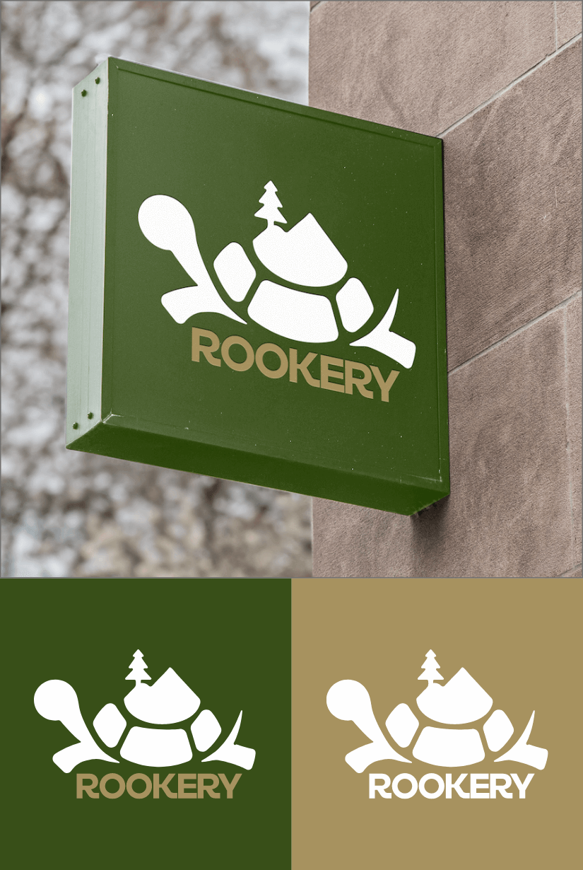
Rookery
Rookery is a family-owned cottage in the heart of Ontario, offering a charming retreat with stunning views of lush landscapes and sparkling waterways. The property is home to a delightful collection of turtles, adding to the natural beauty of the location. Imagine a turtle representing the beauty of Rookery, with the gorgeous scenery showcased within its shell.
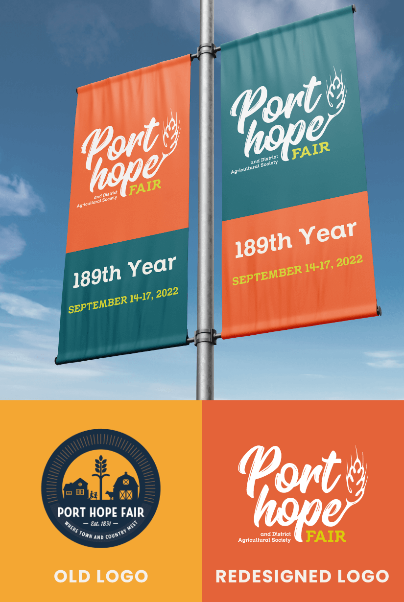
Port Hope Fair
The Port Hope Fair is an annual event organized by the Port Hope & District Agricultural Society. This event is highly anticipated by farmers in Hope Township who come together to showcase their agricultural prowess. As the Agricultural Society was looking to revamp their brand, they needed a logo that captured the essence of the event. Through research, I was able to identify that wheat was the perfect illustration to represent the event. The wheat illustration, combined with the name Port Hope, creates a powerful brand image that resonates with the farming community.
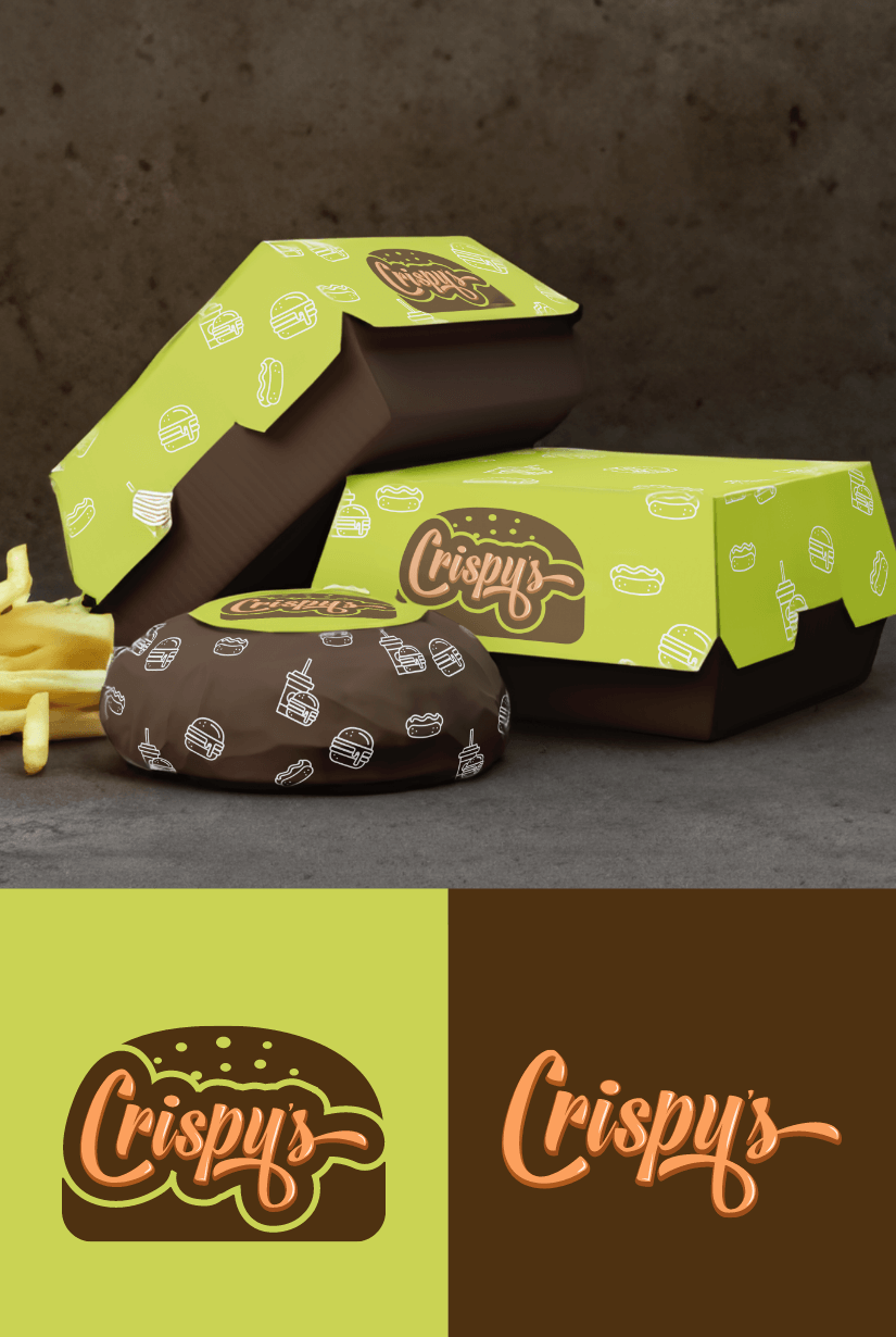
Crispy's
Crispy's, an emerging family hamburger restaurant in Oshawa. They required a logo that evoked a vintage feel, while avoiding the typical fast food chain color palette. After careful consideration, I designed a script wordmark that incorporated a hamburger element. The color scheme I selected was a blend of yellow green, brown, and orange, which perfectly captured the essence of Crispy's brand personality.
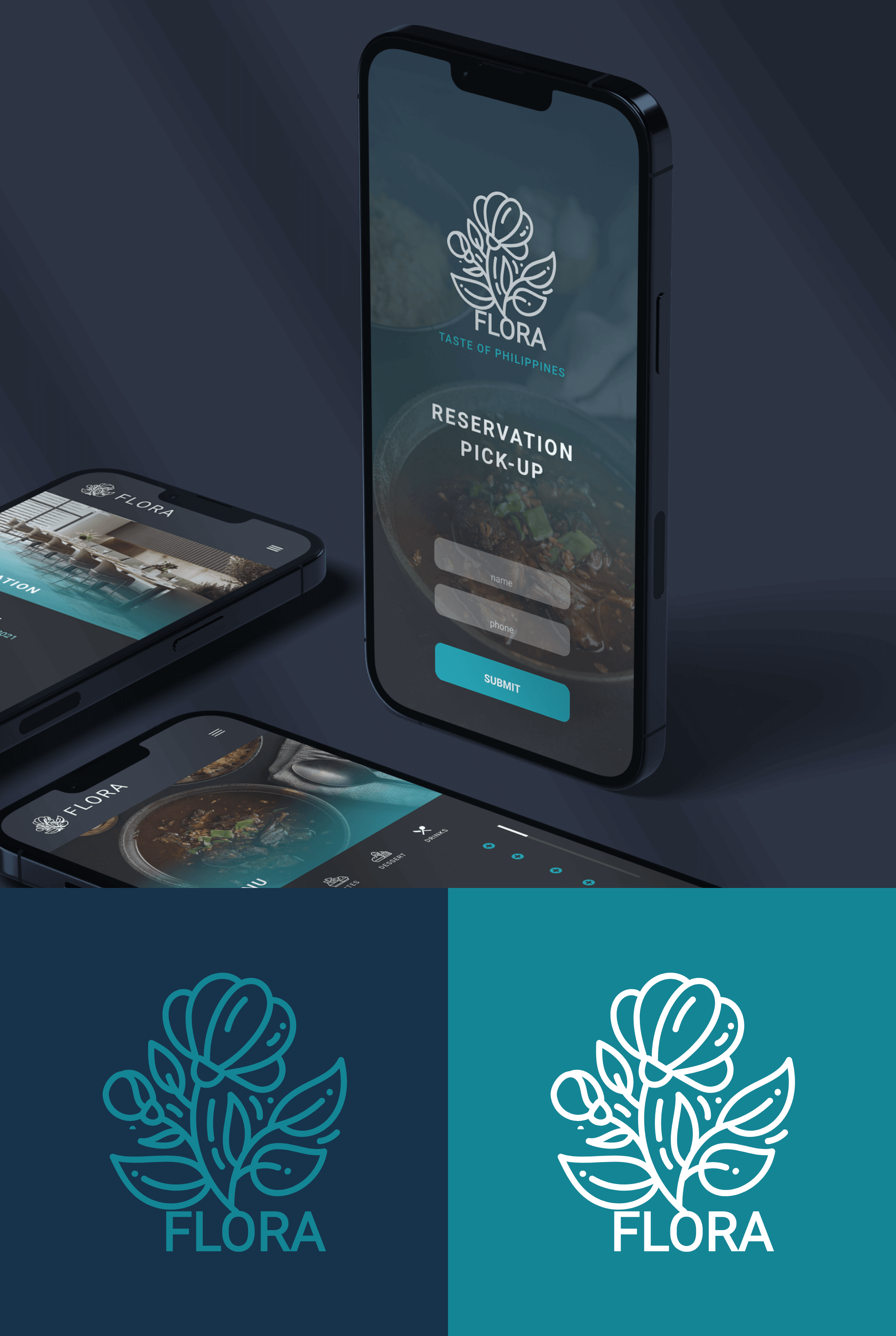
Flora
Flora is a modern Filipino restaurant in Qatar. During pandemic they needed an app for reservation and pickup to anticipate the flow of customers. Since creating an app, they wanted to have a modern style logo and colors. I came up with an illustration of jasmine as it's the national flower of the Philippines and it matches the word Flora.

