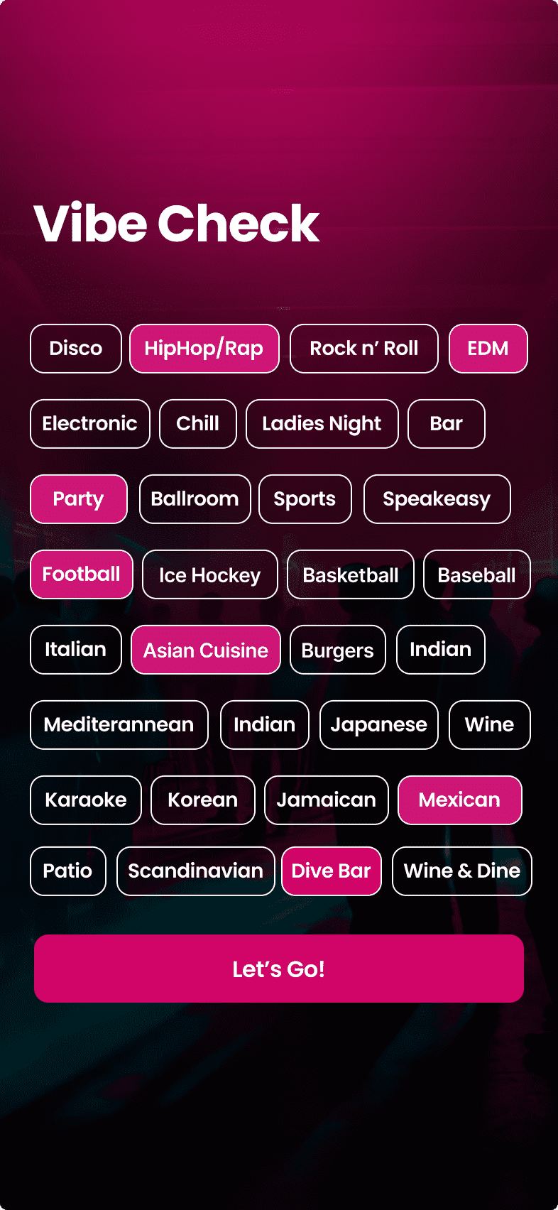
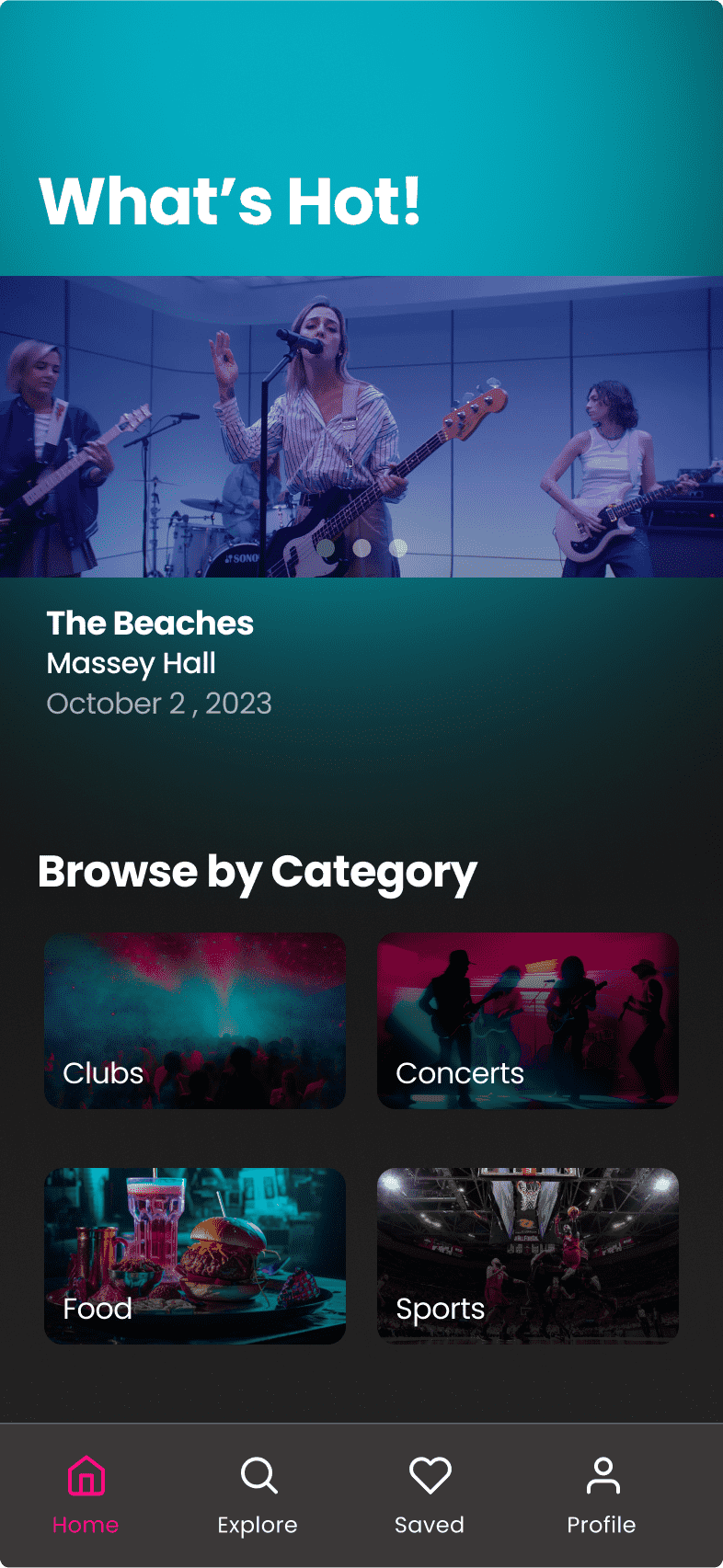
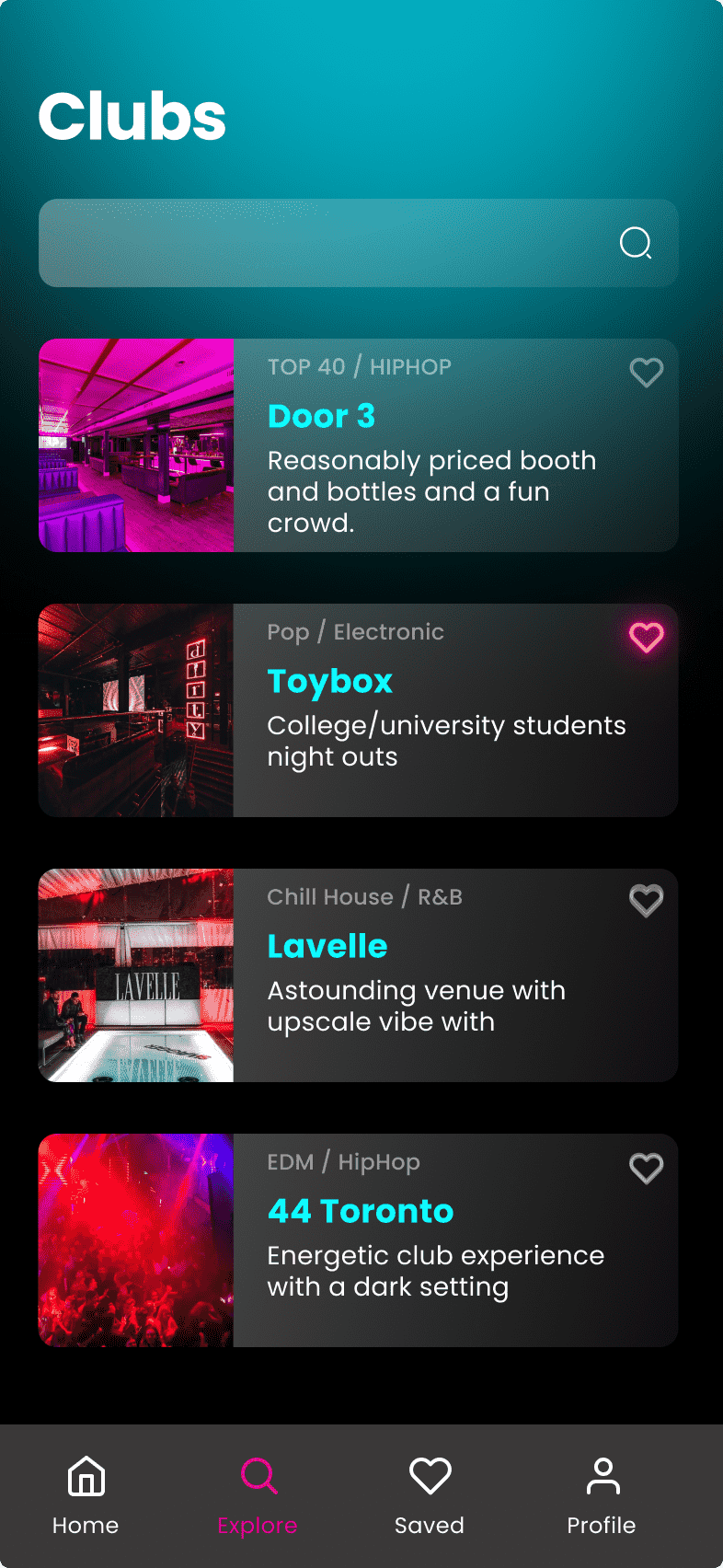
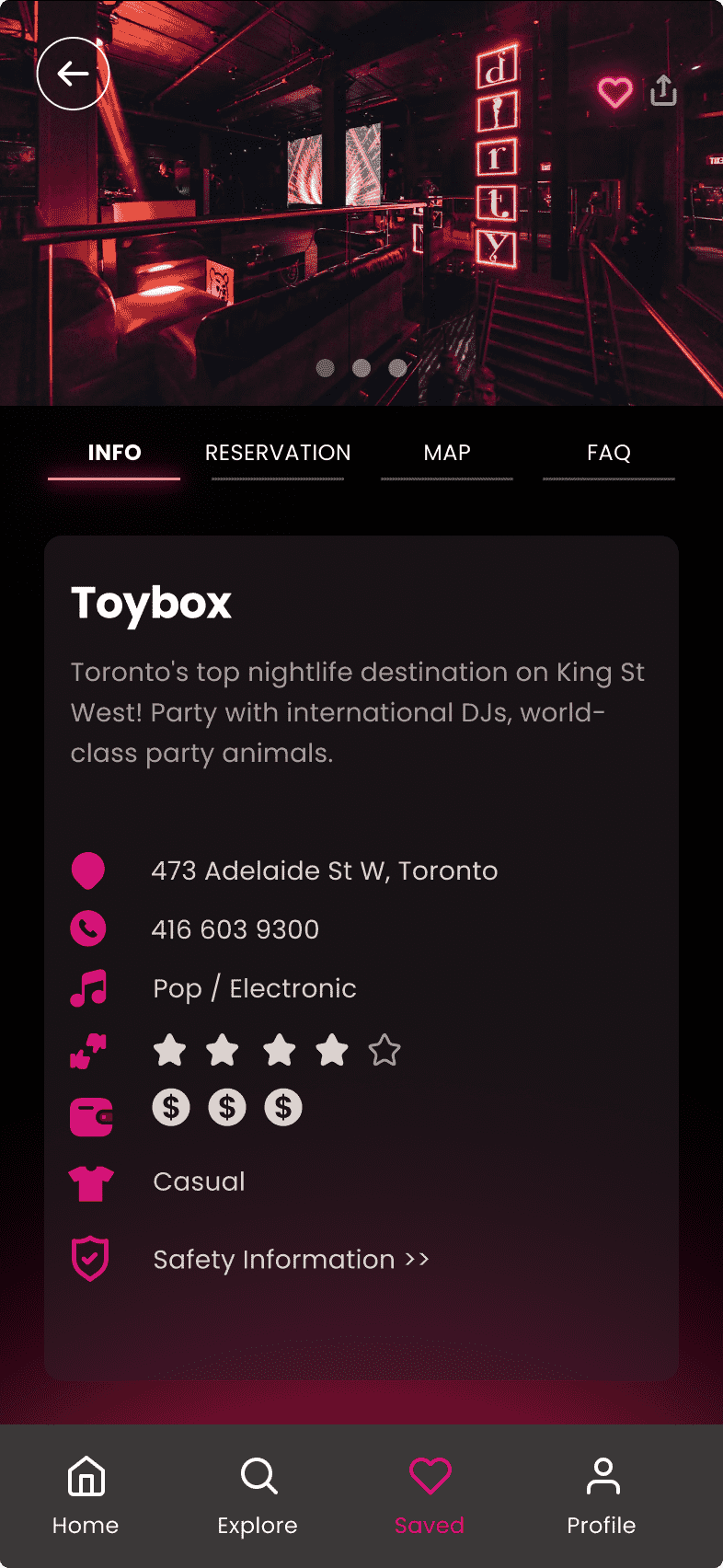
Overview
Get ready to paint the town red with t.o. night – the ultimate
nightlife guide for the GTA! This app is like the neon-lit lovechild
of the CN Tower, here to be your digital nightlife wingman. From hot
clubs to top-rated restaurants, epic concerts to nail-biting sports
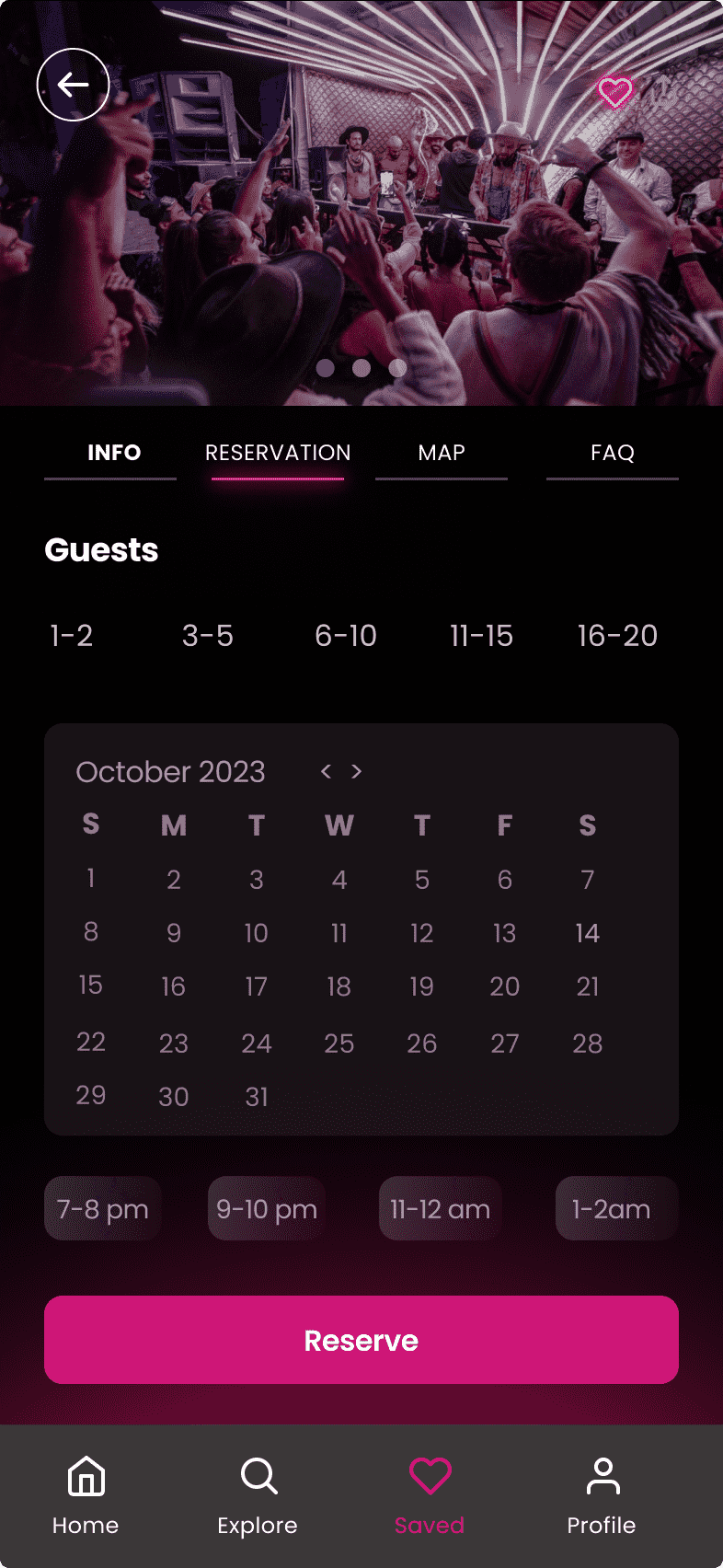
events, T.O. Night has got your back. Need info on costs, dress
codes, bookings, or safety tips? Say no more, we've got all the
deets to make your night out a smash hit
Objective
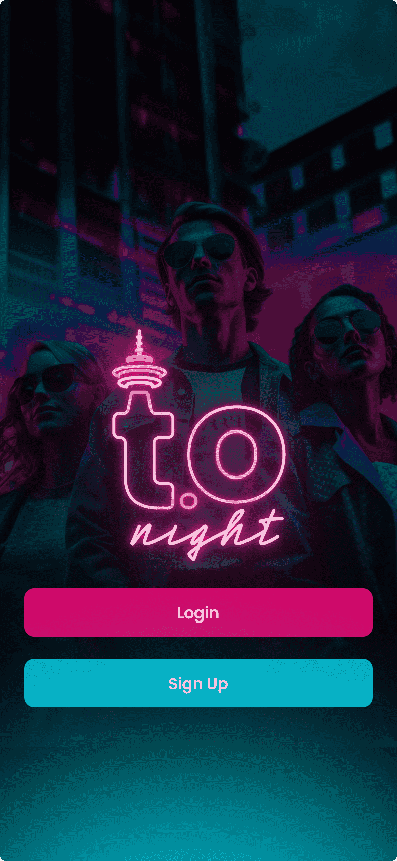
t.o. night's design draws inspiration from Toronto's
vibrant nightlife and its iconic landmarks. The neon lights
reminiscent of the city's bustling streets create a visually
stunning interface that captures the energy and excitement of
Toronto after dark. The logo, featuring a stylized neon CN Tower
outline, serves as a beacon guiding users through the app's
offerings.
With its user-friendly interface and
comprehensive features, the app has garnered rave reviews from users
and industry experts alike. t.o. night has not only simplified the
process of planning a night out but has also contributed to a safer
and more enjoyable nightlife experience for all.